
今回は5.4. Display Order: the order propertyについて。
Flex items are, by default, displayed and laid out in the same order as they appear in the source document. The order property can be used to change this ordering.
Flex items はデフォルトで source document に出現するのと同じ順番で表示・配置される。orderプロパティはこの並び順を変更するために使われる。
| key | value |
|---|---|
| Name | order |
| Value | <integer> |
| Initial | 0 |
| Applies to | flex items |
| Inherited | no |
| Percentages | n/a |
| Computed value | specified integer |
| Canonical order | per grammar |
| Animation type | by computed value type |
The order property controls the order in which flex items appear within the flex container, by assigning them to ordinal groups. It takes a single
value, which specifies which ordinal group the flex item belongs to.
orderプロパティは flex items に ordinal group を割り当てることで、それらが flex container 内で表示される順番を制御する。integer 値を渡して、flex item が所属する ordinal group を指定する。
A flex container lays out its content in order-modified document order, starting from the lowest numbered ordinal group and going up. Items with the same ordinal group are laid out in the order they appear in the source document. This also affects the painting order [CSS21], exactly as if the flex items were reordered in the source document. Absolutely-positioned children of a flex container are treated as having order: 0 for the purpose of determining their painting order relative to flex items.
flex container は、order-modified された document の並び順に沿ってコンテンツを ordinal group の数値の小さい順に配置する。同じ ordinal group の items は、source document に出現する順番で配置される。これは、まるで flex items が source document で並び変えられたかのように正確に、描画の順番にも影響を与える。flex container の絶対配置された子供たちは、flex items と相対的な描画順序を決定するために、0の order を持っているとみなして扱われる。
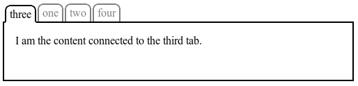
EXAMPLE 6 The following figure shows a simple tabbed interface, where the tab for the active pane is always first:
This could be implemented with the following CSS (showing only the relevant code):
上記の図は、簡単なタブインターフェイスを表したもので、アクティブなタブは常に最初(一番左)に表示される。 これは下のような CSS(関連する部分のみ)で実装される
.tabs {
  display: flex;
}
.tabs > .current {
  order: -1; /* デフォルトの0より小さくする */
}
Unless otherwise specified by a future specification, this property has no effect on boxes that are not flex items.
将来的な仕様で指定されない限りは、このプロパティは flex items ではない boxes には何も効果を与えない。
5.4.1. Reordering and Accessibility
The order property does not affect ordering in non-visual media (such as speech). Likewise, order does not affect the default traversal order of sequential navigation modes (such as cycling through links, see e.g. tabindex [HTML]).
order プロパティは non-visual media(スピーチなど)の順番には影響を与えない。同様に、order プロパティは sequential navigation mode(tabindex のようなリンクを巡回するようなもの)のデフォルトの走査順序にも影響を与えない。
Authors must use order only for visual, not logical, reordering of content. Style sheets that use order to perform logical reordering are non-conforming.
制作者はコンテンツの視覚的な(論理的なのではなく)並び替えに対してのみ order プロパティを使わなければならない。論理的なコンテンツの並び替えに order プロパティを利用したスタイルシートは非準拠である。
Note: This is so that non-visual media and non-CSS UAs, which typically present content linearly, can rely on a logical source order, while order is used to tailor the visual order. (Since visual perception is two-dimensional and non-linear, the desired visual order is not always logical.)
注意:これは、一般的に現在のコンテンツを直線的に出力する、non-visual media と non-CSS ユーザーエージェント(ブラウザなど)が、論理的な source order に依拠できるようにしつつ、一方で order プロパティを利用することで視覚的な順番を調整できるようにするためである。(視覚による知覚は、二次元的であり直線的ではない。望ましい視覚的な順番は常に論理的なものであるとは限らないので。)
EXAMPLE 7 Many web pages have a similar shape in the markup, with a header on top, a footer on bottom, and then a content area and one or two additional columns in the middle. Generally, it’s desirable that the content come first in the page’s source code, before the additional columns. However, this makes many common designs, such as simply having the additional columns on the left and the content area on the right, difficult to achieve. This has been addressed in many ways over the years, often going by the name “Holy Grail Layout” when there are two additional columns. order makes this trivial. For example, take the following sketch of a page’s code and desired layout:
多くのウェブページがマークアップにおいて同じような形、上の方にヘッダーがあり、下側にフッターがあり、真ん中にコンテンツエリアと 1 つか 2 つの付帯的なカラムを持つ。一般的に、ページの source code 上では、付帯的なカラムの前に、コンテンツが最初に来るのが望ましい。しかしながら、この(ソースコードの並び順は)多くのよくあるデザインがするような、付帯的なカラムを左において、コンテンツエリアを右に置くようなシンプルなデザインを作るのが難しくなる。これは長年に渡って様々な方法で対処されてきた課題で、二つの付帯的なカラムを持つレイアウトはしばしば「Holy Grail Layout」という名前で呼ばれてきた。order プロパティはこの課題を簡単なものにする。例えば、次のようなページコードと、望ましいレイアウトのスケッチがあるとする。
<!DOCTYPE html>
<header>...</header>
<main>
  <article>...</article>
  <nav>...</nav>
  <aside>...</aside>
</main>
<footer>...</footer>

This layout can be easily achieved with flex layout:
このレイアウトは flex レイアウトで簡単に作ることができる。
main {
  display: flex;
}
main > article {
  order: 2;
  min-width: 12em;
  flex: 1;
}
main > nav {
  order: 1;
  width: 200px;
}
main > aside {
  order: 3;
  width: 200px;
}
As an added bonus, the columns will all be equal-height by default, and the main content will be as wide as necessary to fill the screen. Additionally, this can then be combined with media queries to switch to an all-vertical layout on narrow screens:
追加特典として、カラムはデフォルトで同じ高さになり、メインコンテンツは画面を埋めるのに必要なだけの幅になる。さらに、media queries と組み合わせることで、狭い画面上においては縦一列(all-vertical)のレイアウトにスイッチすることができる。
@media all and (max-width: 600px) {
  /* 3カラムに対応するには狭すぎる */
  main {
    flex-flow: column;
  }
  main > article,
  main > nav,
  main > aside {
    /* documentの並び順にする */
    order: 0;
    width: auto;
  }
}
(Further use of multi-line flex containers to achieve even more intelligent wrapping left as an exercise for the reader.)
(読者のための演習として、複数行の flex container を使ってよりインテリジェントに囲う方法もあることを記しておく)