今回は6. Flex Linesについて。
Flex items in a flex container are laid out and aligned within flex lines, hypothetical containers used for grouping and alignment by the layout algorithm. A flex container can be either single-line or multi-line, depending on the flex-wrap property:
Flex container の中の flex items は、flex lines、レイアウトアルゴリズムによってグループ化や整列のために利用される仮想上のコンテナに沿って配置され、整列される。flex container は 1 行か複数行かとなるが、それは flex-wrap プロパティに依存する。
A single-line flex container (i.e. one with flex-wrap: nowrap) lays out all of its children in a single line, even if that would cause its contents to overflow.
single-line flex container(flex-wrap: nowrapになっているなど)は、たとえコンテンツがオーバーフローを起こしたとしても、すべての子供が 1 行の中に配置される。
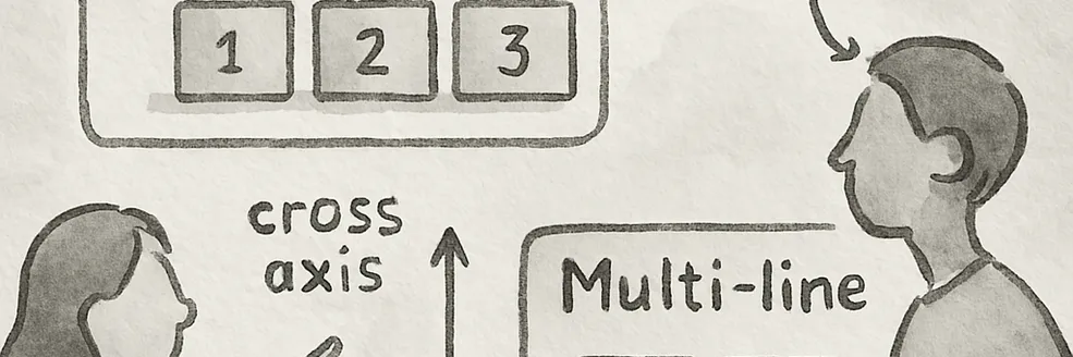
A multi-line flex container (i.e. one with flex-wrap: wrap or flex-wrap: wrap-reverse) breaks its flex items across multiple lines, similar to how text is broken onto a new line when it gets too wide to fit on the existing line. When additional lines are created, they are stacked in the flex container along the cross axis according to the flex-wrap property. Every line contains at least one flex item, unless the flex container itself is completely empty.
multi-line flex container(flex-wrap:wrapまたはflex-wrap:wrap-reverse)は、テキストが長すぎて既存の行に収まらない場合に開業をするのと同じように、flex items を複数行に分ける。追加の行が作成されたとき、それらは flex container の中を、flex-wrap プロパティにしたがって cross axis の方向に沿って積み重なる。flex container 自身が完全に空ではない限り、それぞれの行には少なくとも 1 つの flex item が含まれる。
EXAMPLE 9 This example shows four buttons that do not fit side-by-side horizontally, and therefore will wrap into multiple lines.
この例では、水平に並んで表示するには収まりきらない 4 つのボタンの礼を表示している。ボタンは複数行に折り返される。
#flex {
  display: flex;
  flex-flow: row wrap;
  width: 300px;
}
.item {
  width: 80px;
}
<div id="flex">
  <div class="item">1</div>
  <div class="item">2</div>
  <div class="item">3</div>
  <div class="item">4</div>
</div>
Since the container is 300px wide, only three of the items fit onto a single line. They take up 240px, with 60px left over of remaining space. Because the flex-flow property specifies a multi-line flex container (due to the wrap keyword appearing in its value), the flex container will create an additional line to contain the last item.
コンテナの横幅は 300px であるから、3 つの item までが 1 行に収まる。それらは 240px までを占め、60px が余白スペースとして残る。flex-flowプロパティが multi-line flex container を指定しているから(値の中に wrap キーワードが表示されるため)、flex container は追加の行を作成し、最後の item をそこに含める。

Once content is broken into lines, each line is laid out independently; flexible lengths and the justify-content and align-self properties only consider the items on a single line at a time.
コンテンツが複数行に分かれたら、それぞれの行は独立的に配置される。flexible lengths, justify-content, align-self のプロパティは 1 回につき 1 行ごとの items のみを考慮する。
In a multi-line flex container (even one with only a single line), the cross size of each line is the minimum size necessary to contain the flex items on the line (after alignment due to align-self), and the lines are aligned within the flex container with the align-content property. In a single-line flex container, the cross size of the line is the cross size of the flex container, and align-content has no effect. The main size of a line is always the same as the main size of the flex container’s content box.
複数行の flex container(1 行しかない場合でも)では、各行の cross size は、(align-self によって整列された後)行の中に flex items が入るために必要な最小限のサイズになる。1 行の flex container では、行の cross size は flex container の cross size になり、align-content は効果を持たない。行の main size は、常に flex container の content box の main size と同じになる。
EXAMPLE 10 Here’s the same example as the previous, except that the flex items have all been given flex: auto. The first line has 60px of remaining space, and all of the items have the same flexibility, so each of the three items on that line will receive 20px of extra width, each ending up 100px wide. The remaining item is on a line of its own and will stretch to the entire width of the line, i.e. 300px.
次のは前のと同じ例だが、flex items がflex:autoになっている点が異なる。最初の行は 60px の余白スペースがあり、items のすべてが同じ flexibility を持っているので、行にある 3 つの items のそれぞれが 20px の追加幅を受け取り、最終的に横幅 100px になる。残りの item はそれ自体が 1 行となり、行の全体の幅(300px)まで広がる。
