
今回は4.4. Collapsed Itemsについて
Specifying visibility:collapse on a flex item causes it to become a collapsed flex item, producing an effect similar to visibility:collapse on a table-row or table-column: the collapsed flex item is removed from rendering entirely, but leaves behind a “strut” that keeps the flex line’s cross-size stable. Thus, if a flex container has only one flex line, dynamically collapsing or uncollapsing items may change the flex container’s main size, but is guaranteed to have no effect on its cross size and won’t cause the rest of the page’s layout to “wobble”. Flex line wrapping is re-done after collapsing, however, so the cross-size of a flex container with multiple lines might or might not change.
Though collapsed flex items aren’t rendered, they do appear in the formatting structure. Therefore, unlike on display:none items [CSS21], effects that depend on a box appearing in the formatting structure (like incrementing counters or running animations and transitions) still operate on collapsed items.
flex itemにvisibility:collapseを指定するとflex itemが折り畳まれるようになり、table-rowやtable-columnにおけるvisibility:collapseと同様の効果を得ることができる。折り畳まれたflex itemはレンダリングから完全に削除されるが、flex lineのcross-sizeを安定させるための「支柱」を残す。そのため、もしflex containerにflex lineが一つしかない場合、itemsを折り畳んだり開いたりすることはflex containerのmain sizeを変更するかもしれないが、cross sizeには効果を及ぼさないことが保証され、ページの残りのレイアウトが「揺らぐ」ことはない。しかしながら、Flex lineの折り返しは折り畳まれた後に再度折り返しが実行されるので、複数行にまたがるflex containerのcross-sizeは変わるかもしれないし、変わらないかもしれない。
折り畳まれたflex itemsはレンダリングされないけれども、それらはformatting structureには出現する。したがって、display:noneとは異なり、(incrementing counterやアニメーションやtransitionなどの実行のように)formatting structureに現れるboxに依存する効果は、折り畳まれたitemに対しても実行が続く。
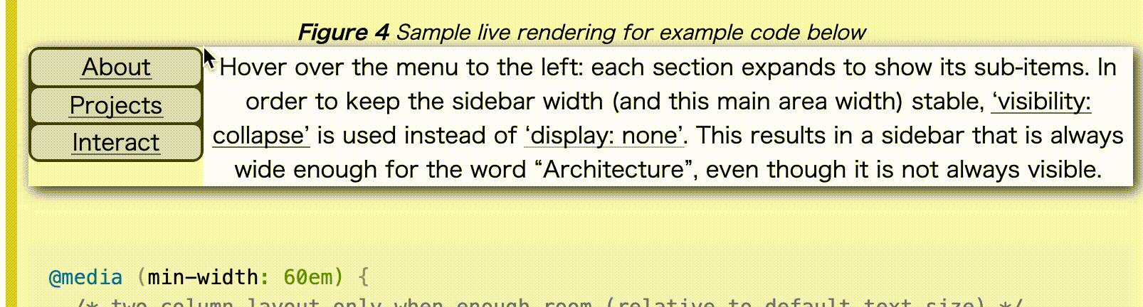
EXAMPLE 4 In the following example, a sidebar is sized to fit its content. visibility: collapse is used to dynamically hide parts of a navigation sidebar without affecting its width, even though the widest item (“Architecture”) is in a collapsed section.
次の例では、サイドバーはコンテンツに合わせてサイズが調整される。visibility: collapseはサイドバーの一部分を動的に見えなくする。たとえ最も幅が広いアイテム(ここでは「Architecture」の項目)が折り畳まれたセクションにある場合でも、横幅に影響が出ないようになっている。
@media (min-width: 60em) {
  /* 十分な空間があるときだけ2カラムのレイアウトになる
  (文字サイズはデフォルトのサイズから相対的に決まる) */
  div {
    display: flex;
  }
  #main {
    flex: 1; /* メイン部分は残った空間全てを使う */
    order: 1; /* (右の)ナビゲーションの後に配置する */
    min-width: 12em; /* メインコンテンツのサイズを最適化する */
  }
}
/* メニューのアイテムはvisibility:collapseが動くように
flex layoutを利用する。 */
nav > ul > li {
  display: flex;
  flex-flow: column;
}
/* サブメニューはターゲットでないときに折り畳まれる */
nav > ul > li:not(:target):not(:hover) > ul {
  visibility: collapse;
}
<div>
  <article id="main">Interesting Stuff to Read</article>
  <nav>
    <ul>
      <li id="nav-about"><a href="#nav-about">About</a> …</li>

      <li id="nav-projects">
        <a href="#nav-projects">Projects</a>
        <ul>
          <li><a href="…">Art</a></li>
          <li><a href="…">Architecture</a></li>
          <li><a href="…">Music</a></li>
        </ul>
      </li>

      <li id="nav-interact"><a href="#nav-interact">Interact</a> …</li>
    </ul>
  </nav>
</div>
<footer>…</footer>
flexショートハンドは、以下のような定義になっている。
none | [ <‘flex-grow’> <‘flex-shrink’>? || <‘flex-basis’> ]`
flex: 1の場合、flex: 1 1 0 と記述されるのと同じになる。未設定の初期値は flex: 0 1 autoとなるのだが、7.1.1. Basic Values of flexに以下のような説明がついている。
flex: initial Equivalent to flex: 0 1 auto. (This is the initial value.) Sizes the item based on the width/height properties. (If the item’s main size property computes to auto, this will size the flex item based on its contents.) Makes the flex item inflexible when there is positive free space, but allows it to shrink to its minimum size when there is insufficient space. The alignment abilities or auto margins can be used to align flex items along the main axis.
flex itemはwidth/heightのプロパティに基づいてサイズ調整される(もしitemのmain sizeプロパティがautoと計算された場合、そのコンテンツを基にサイズが調整される)。空いてるスペースがある場合、flex itemは不変(inflexible)であるけど、十分なスペースがない場合は最小サイズまで縮小することができる。alignmentやauto marginsはmain axisに沿ってflex itemsを揃えるために使われる。
つまり、上の例のCSSの場合、navの部分の横幅は(十分な空間があれば)コンテンツの長さと同じになる。その時のコンテンツの長さはvisibility: collapseによる影響を受けない。#mainの部分は空いてる空間に応じて広がる。
orderの初期値は0なので(5.4. Display Order: the order property)、order: 1を設定することで、<nav>の方が先に配置される。
To compute the size of the strut, flex layout is first performed with all items uncollapsed, and then re-run with each collapsed item replaced by a strut that maintains the original cross-size of the item’s original line. See the Flex Layout Algorithm for the normative definition of how visibility:collapse interacts with flex layout.
「支柱(strut)」のサイズを計算するために、flexレイアウトは最初にすべてのitemを折り畳まれていない状態(uncollapsed)で実行され、その後に、折り畳まれるitemをitemのオリジナルの行のオリジナルのcross-sizeを維持する支柱によって置き換えて再実行する。
Note: Using visibility:collapse on any flex items will cause the flex layout algorithm to repeat partway through, re-running the most expensive steps. It’s recommended that authors continue to use display:none to hide items if the items will not be dynamically collapsed and uncollapsed, as that is more efficient for the layout engine. (Since only part of the steps need to be repeated when visibility is changed, however, ‘visibility: collapse’ is still recommended for dynamic cases.)
flex itemにvisibility:collapseを使うことは、flexレイアウトのアルゴリズムを途中で繰り返すことになり、最も高コストなステップを再実行することになる。もしitemを動的に折り畳んだり展開したりしないなら、アイテムを非表示にするのには display:none を使うことを推奨する。レイアウトエンジンにとってその方が効率的だから。(しかしながら、visibilityが変わったらステップの一部は繰り返す必要があるので、動的に変更するケースにおいては visibility: collapse は推奨される)。